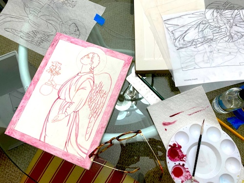
Often when I teach icon writing classes, I am asked to critique students’ previous icons, and almost always, my comments revolve around drawing more. Re-draw the composition, or the faces, or the figures. And so, for this blog post I am including some random ideas for improving your icon drawing.

First, I’d like to share about an iconographer whose drawings I particularly admire- Nun Juliana. Mother Juliana was a Russian icon painter who was a prominent figure in the renewal of sacred arts in Russia during the second half of the 20th century.

She was also a teacher of iconography, discussing the meaning of the subject matter, technique, materials, and style. Mother Juliana’s work was part of a rediscovery and renewal of sacred arts that has reached world wide proportions.
Today Mother Juliana is considered a saint by the Orthodox Church and is credited with preserving the tradition of icon painting in Russia and beyond through her work and those she taught.
During the first decades of Soviet rule in Russia holy images, especially icons, were subjected to harsh persecution. It was a period of unrestrained, militant atheism during which, together with the closing of churches and monasteries, great numbers of icons were destroyed. From this it is easy to comprehend the difficulties faced by those who wished to preserve the traditions of Russian icon painting.

The nun Juliana, known to the world as Maria Nikolajevna Sokolova, preserved the living tradition of ancient Russian icon painting, transmitting it to her successors during one of the most difficult periods in the history of the Russian Church. This is the basis of her significance for modern icon painters.

Egon Sendler’s states in his foundational book, “The Icon, Images of the Invisible”, that “The drawing is of great importance because it gives structure and movement to the icon and determines the surfaces to be painted. The ancient iconographers religiously kept the sketches of their icons so they could use them again in their later works. These collections of drawings were called podlinik, pattern books.”
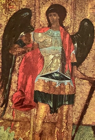
We know that in the Byzantine method, a relational system of proportions was employed, thus giving a consistency to the visual images that allow the viewer to concentrate on the meanings of the icon. This system of relational proportions was probably inherited by Egyptian artists who also used a simple grid system to standardize proportions of figures.

Byzantine compositional drawing develops a relationship with rhythm and space in the icon that enables the viewer and the icon to meet- the dynamic elements of the icon are intentionally created to engage the viewer and bring them into a relational experience with the subject of the icon.
Without depth, the vertical method of composition is used in Byzantine compositional drawing, for example, objects which are behind in the icon are placed above in the composition, and those in front are placed on the lower section of the composition. The Nativity icon is a very good example of this principle.

The last set of ideas I wish to share with you derive from Iconographer George Kordis in his book, “Icon as Communion”. In speaking of the artistic principles of Byzantine art this is what he says, “This is what we recognize as Byzantine art, and it bears the following characteristic features:
- The absence of artistic depth (there is no movement behind the artistic surface.)
- The essential role and fundamental importance of color in rendering form: forms are defined through color and not through the use of black or shadow..
- The essential role and fundamental importance of line, which determines how color is applied…
- The plasticity of artistic form (the juxtaposition of light and dark) in order to give the feeling of movement outward from the artistic surface toward the beholder.
- The pursuit of rhythm (the sense of movement that relates the figure to the viewer, uniting the two.)
Obviously this article is presenting the tip of the iceberg! Hopefully these thoughts stimulate your creative process and help your icons become the best representation of God’s kingdom possible. Although I am familiar with all of these principles, I find that I need to read them often to keep them constantly in mind when I draw.
Below are some interesting links from Iconographer Dorothy Alexander:
- Father Dingman, the iconographer, reposed in 2022. This is a well made and very interesting 45 minutes documentary following the iconography he was working on for St. Lawrence Orthodox Church in Felton, CA, as he was also on a journey with parkinson’s disease. https://www.youtube.com/watch?v=w9ASpT8L7hE
- The Monastery of St. Anthony in Egypt has been active for almost 2,000 years. Here is a presentation on the restoration of the original Coptic iconography: https://artsandculture.google.com/story/resurrecting-the-monastery-of-st-anthony-american-research-center-in-egypt/tgXBRioluve_Dg?hl=en
- Connie Ash passed on this wonderful site for Gilding Recipes from Watergild Studios in England.
Here is a link to the Icon retreats I am teaching this year: Icon Retreats
And here is link describing the Artist in Residence program I am participating in at the Cathedral of Saint Peter, Saint Petersburg, Florida.
Until next month,
Blessings,
Christine Simoneau Hales